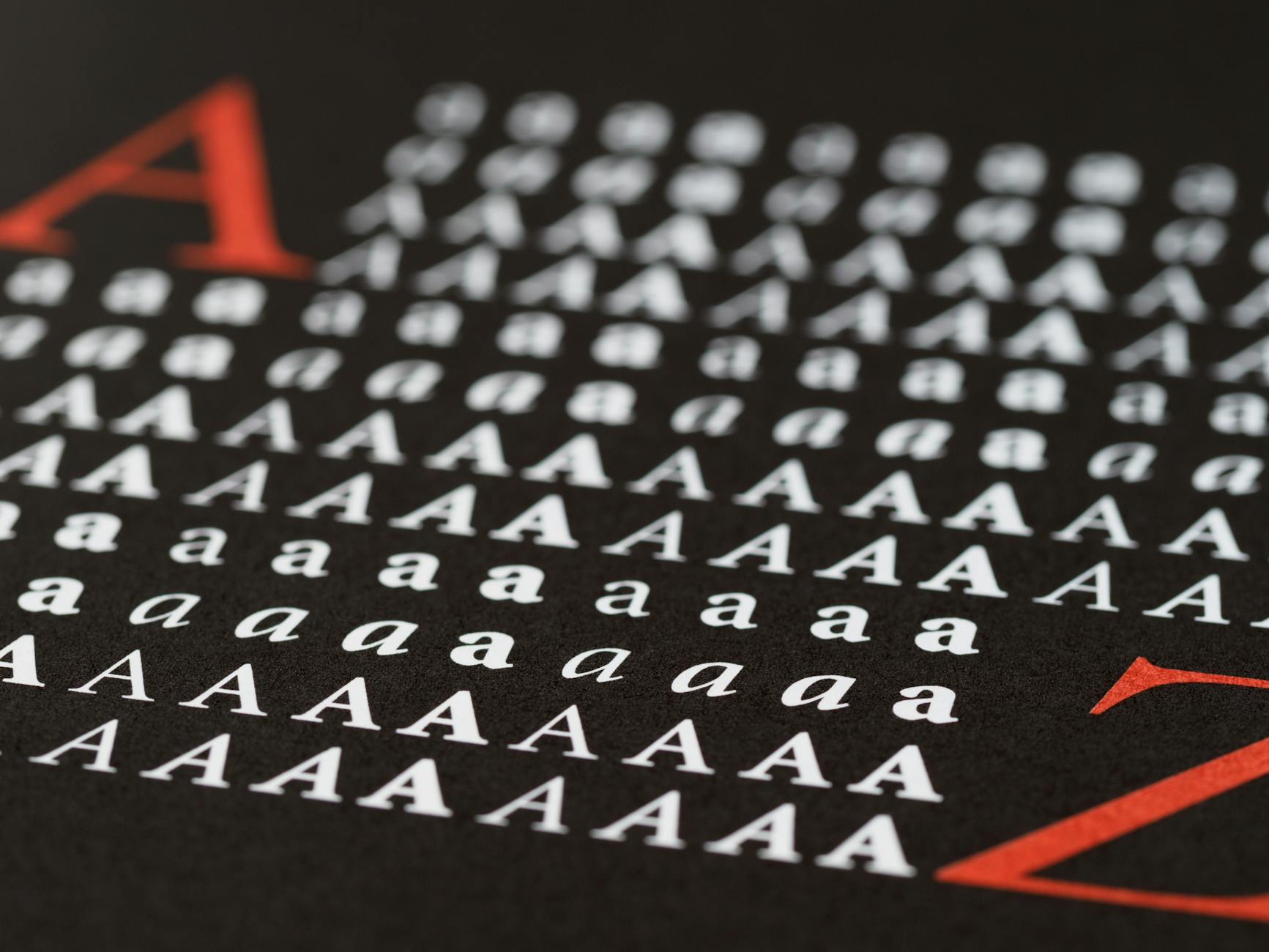
The ClearType Font Collection, launched by Microsoft in 2005, marked a significant step forward in digital typography. This collection was designed to optimize readability on LCD screens, enhancing user experience through improved text clarity. In this article, we’ll delve into the innovations brought about by this collection, its impact on typography, and how to use these fonts effectively today.
Introduction to ClearType Technology
ClearType technology, introduced by Microsoft, aimed to improve text readability on LCD monitors. Leveraging subpixel rendering, it increased the perception of sharper and more legible text. This was particularly beneficial for screens with lower resolutions, where text clarity was often compromised.
What Changed: Key Innovations in 2005
The 2005 ClearType Font Collection introduced several modern typefaces such as Calibri, Cambria, and Candara. These fonts were designed with specific attention to readability at smaller sizes, prioritizing user comfort and enhancing digital content presentation.
Why It Matters: Impact on Typography
Typography is a critical component of user experience. The ClearType collection’s introduction emphasized the importance of font design that aligns with digital media, providing clearer text and reducing eye strain. This has influenced contemporary design, encouraging developers and designers to prioritize usability in font choices.
How to Use ClearType Fonts Effectively Today
To maximize the benefits of ClearType fonts today, consider the following:
- Choose fonts like Calibri and Cambria for documents intended for screen reading.
- Test font readability across various devices to ensure consistency.
- Balance font size and line spacing to enhance legibility.
Potential Challenges and Considerations
Determining the best font choice in contexts where platform consistency is essential can be challenging. Variations in rendering engines mean that fonts may appear differently across devices. Always test on multiple platforms to preserve design integrity.
Conclusion: Future of Font Design
The introduction of the ClearType Font Collection has been pivotal in advancing digital readability. As technology continues to evolve, the principles behind ClearType serve as a foundation for future typographic innovations. Ongoing developments will undoubtedly continue to shape how content is consumed across digital platforms.
Sources
Transparency Note: This article was assisted by AI, and automation verified the sources used. The content reflects a blend of expert analysis and technology-based insights.